Why do we have a new logo?
The logo is part of the planned rebranding project (visual identity) which forms part of the Town Council’s Communications Strategy. It is also part our ongoing move towards greater accessibility which is driven by new website legislation.
The Town Council was established in 1974 and adopted the Town Crest to use on its official documents. The use of the Town Crest was not exclusive to the Town Council and has been used by other organisations in the town.
As we have moved into the digital age it has become apparent that we need a logo that is scalable and suitable for use across a variety of digital and print formats, that also depicts some of the town’s history. Our new logo provides an instantly recognisable way to identify Witney Town Council documents and social media accounts.
Like many other local authorities, the town we serve has seen considerable change over the last ten years and some of the demands and challenges we face have transformed the ways in which we work and how we deliver our services. In almost 50 years our logo has not evolved to reflect this and our rebranding aims to address this.
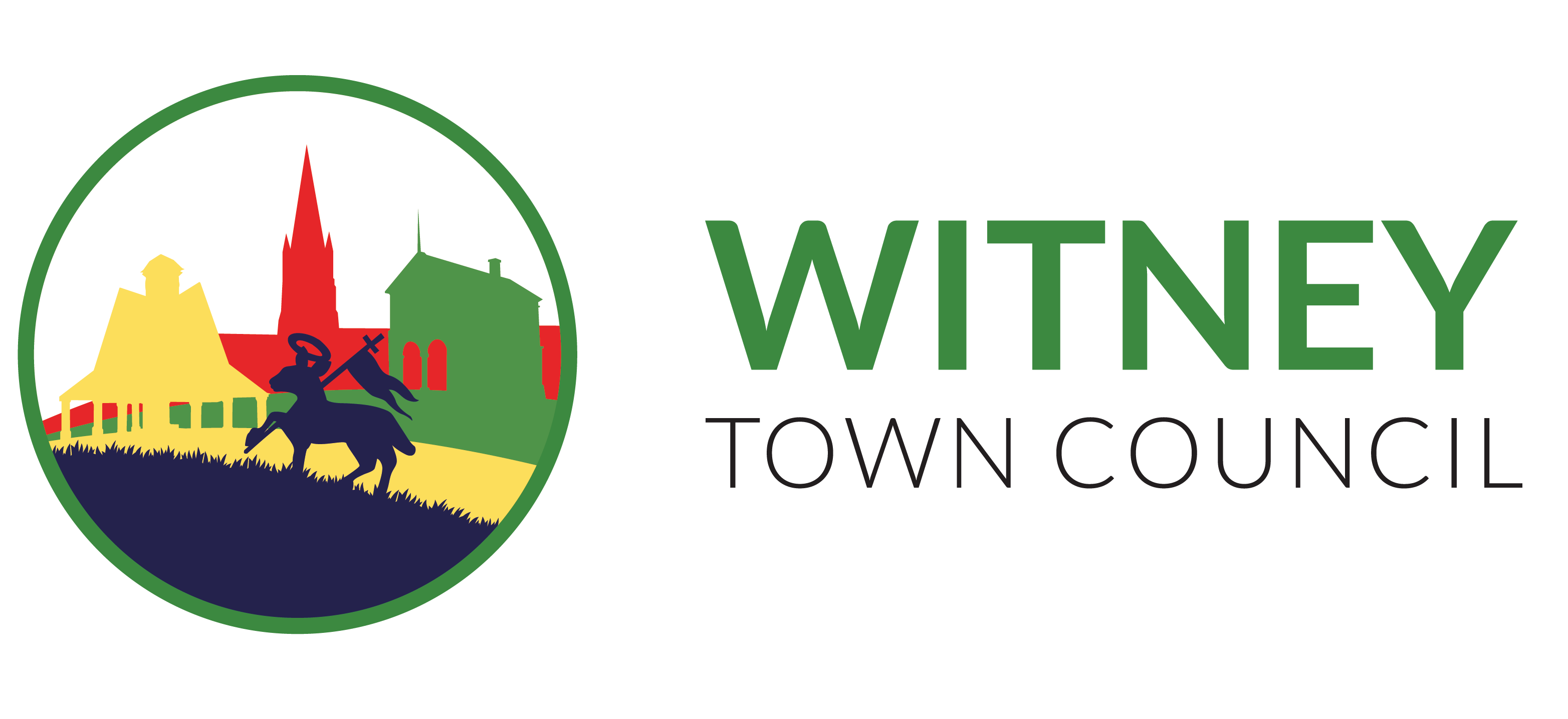
The logo depicts three distinctive buildings, St Mary’s Church, the Buttercross and the Town Hall, and incorporates the pascal lamb which features on the town crest and in the stained-glass window above the door of the Corn Exchange. The colours are inspired by traditional Witney blankets.

We will implement the new branding on our social media and documents and other items will be rebranded as they need replacing.
